
hola los angeles! a quick elevator ride through some of my favorite design projects / my fine art is here
![]()
12/15/17: this page is under edit is a few of my favorite graphic desogn, advertising and branding projects is a strategic creative studio committed to the servicing our clients and the client's return.what you won't see here is the standard stardumb nonsense (been there/done that for the full 15 minutes) there is not a list of the 250+ industry awards, namedropping or the blah blah yadda yadda yadda. you'll also meet my team cary di cristina + elle boudreaux, creme of the creative crop. for large projects we partner with large market agencies and studios to deliver the best creative anywhere on planet earth.
editare personal favorites: summer 17: a few online workshops. 2 logos, establishing an online marketplace. releasing a collection of custom type—all posted at facebook.late august delivery of motion design project.
edit news: mistaken identity / leggo my logo i am the designer of the first ff squared, yen yang logo. with well documented proof. although designed in 1984 as a sophmore at lsu. it remains one of my favorite signatures. yes, i'm aware of ffontshop, i was one of their first usa customers. i'm somewhat flattered. they rotated my pre-historic logo, they market products i love, so it's cool (and it's ancient history) but people are always asking about it. funny how a logo i made in 1984 with radiograph pen and cthruruler defies trend as it remains in use and abuse.
for more samples, capabilities list, cv + bio see linkedin and facebook. facebook, instagram and frankford.com contain recent work / but the good stuff is only available for prospect reviews. divided in 4 seperate industry specialization portfolios: fedex or ups delive
![]()
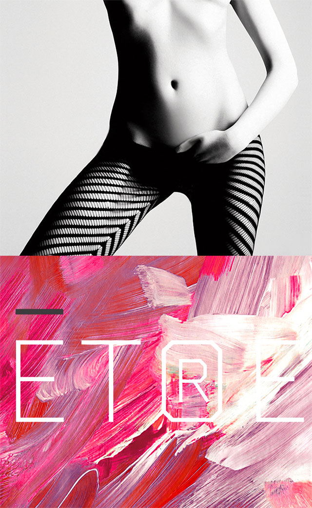
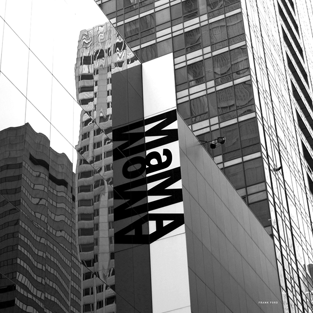
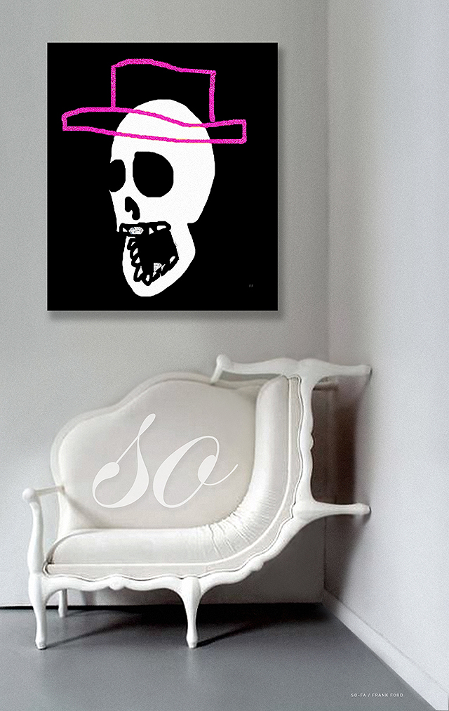
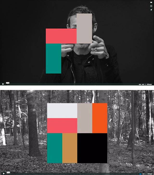
next project: etre womens fine hosiery

![]()
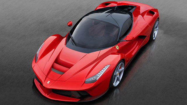
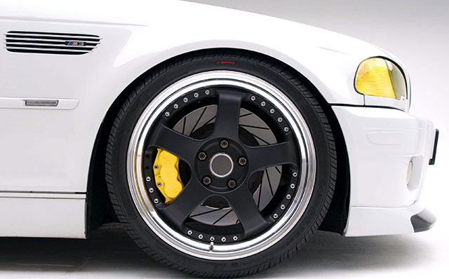
next project: ferrari
extensive advertising campaings >
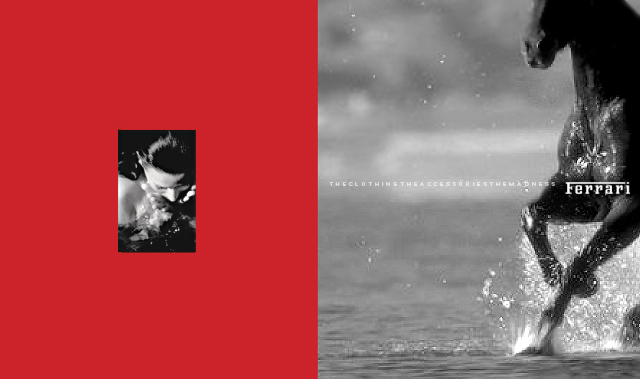
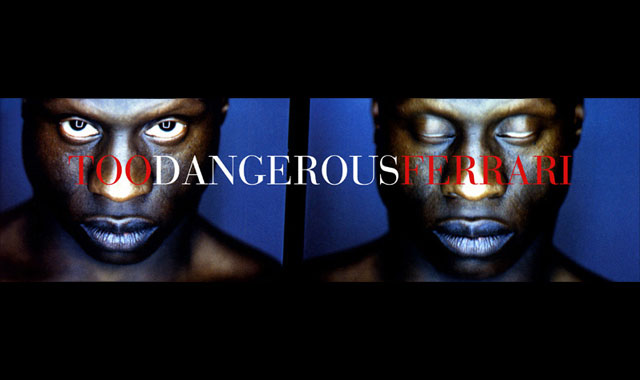
advertising projects for ferrari / collateral + outdoor
our brand strategy meetings + their outcomes.tagline for this round: "the clothing. the accessories. the madness"
outdoor + clothing taglines: too dangerous, too macho, too italian, too intens
![]()
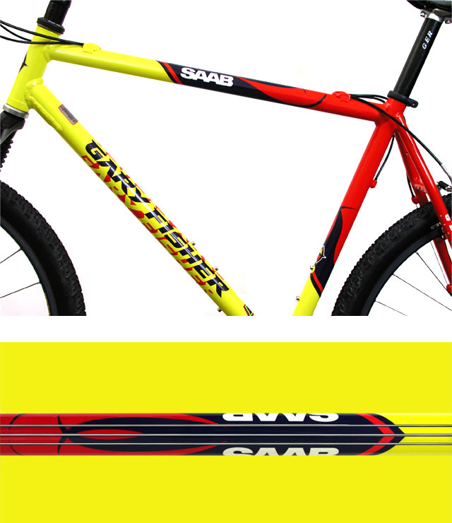
brand identity / saab + gary fisher co–brand / thrilling work with non-billable late night hours
wrong text replace replace replace are now available direct / i'm adding useage samples daily.7of the 20–something fonts i created for commercial sale /
below are samples of each that t i've used on client projects.these are now for sale direct, no middlemen. fyi: these are display fonts (meaning they are intended to be used youuuuuuge! if you're googling my fonts, you've found them. previously marketed by thirstype, t26 + prototype.i took them off the market five years ago. making 50% for wrist-cracking work while the foundries made 50% while sleeping. ugh. no .
still make custom corporate and identity fonts.many of them are at my online portfolio was my most popular typeface. a big family of 7 styles. 2 of the styles were in wide use in television, film and graphic design. technoire is deemed by typographical gearheads as the most influential font of the1990's (topping 4 emigre fonts) a career–thrilla! pricing? dirt cheap. free to students and faculty.also free if used on a high exposure project crediting me as typographer.i'm not sure what to charge. email me, we'll work it out for peanuts i'm sure. my paypal=ideas@frankford.com. custom typefacces available with retaiiner, but it'll runya. it's an incredible amount of work.
the 7: technoire | ghetto prince | stroke | zydeco | paradise | loving the alien < free sample
![]()
![]() next: sport brand love / some of my best work is with sport brands.maybe its because they let me loose with my esoteric sensibilities
next: sport brand love / some of my best work is with sport brands.maybe its because they let me loose with my esoteric sensibilities
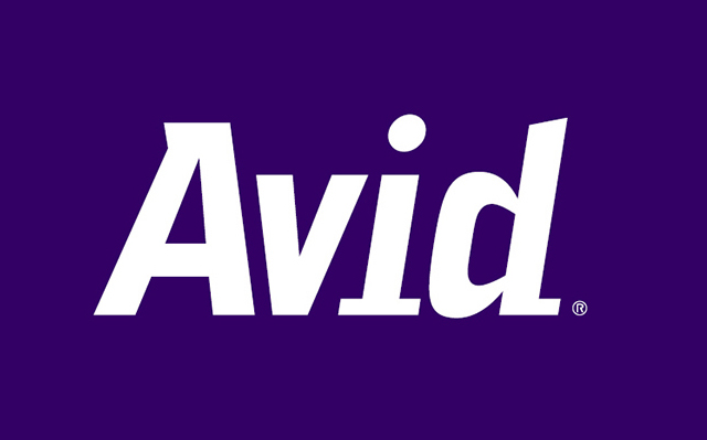
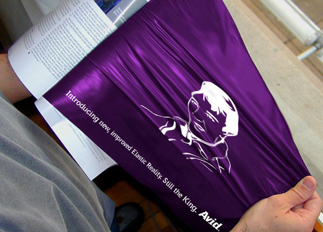
one of many campaign taglines: "tools for storytellers"
logo, copy, collateral, print + digital advertising and a custum font family of 12 for avid technology, inc.
very gratifying work. most longterm projects are.with a load of advertising, collateral and 12 custom typefaces, tagline definition, supporting statements, copywriting, graphic design, image design = many a snowy new england night! some commercial art is not temporary. atleast thats what i shoot for.
![]()
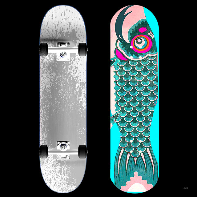
next project / socal skate
![]()
mirage furniture / complete branding and collateral project. longterm..
one of the greatest clients ever. challenged me to deliver some of my best work of all times. they were supportive to the point that — when i suggested we print the business cards on aluminum sheets? no problem. my clients take stage front/center, i'm the support system, i work the background, empower their success with real collaboration and strive for their roi projections.for me, it's like a musician finding a natural high by just jamming away. the only difference my audience is the client. as long as i remain relevant, they cheer me on, they put the food on my table. my days of design awards have turned into my days of design re*wards.i've rocked my roll, loved my 15 minutes.correction—i'm not done. i just dont tour any longer. fyi kids: i'm improving with age! dont bury me, i'm nowhere near dead yet. when i find the mick jagger to my keith richards?sparkswillfly
![]() bio / abilities / tablestakes / press
bio / abilities / tablestakes / press
![]()
™teachable moment(s) my 3 main mentors
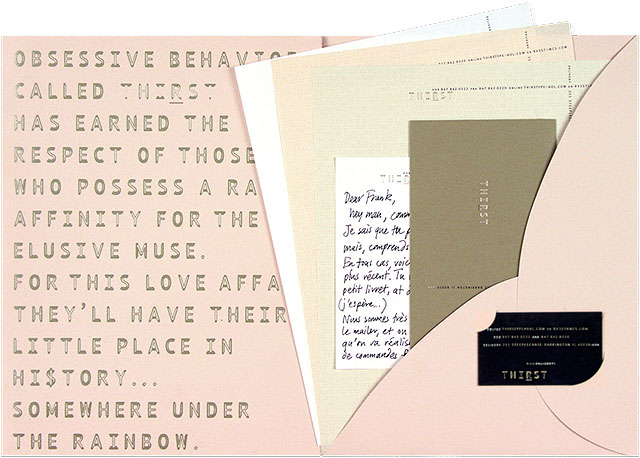
an identity that made directors at tiffany's & cartier slobber. this and jager's living brand brochure are my most "not returned" portfolio sample ever.
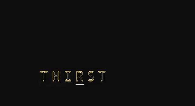
brand identity for design firm thirst / i was offered a job at tiffany's nyc based on this project and just 2 others that i showed. left behind as gift
™<teachable moment(s)>
5 mentors that shaped my entire career: some of my most meaningful work has been under rick's baton. several remain unpublished-but not for too much longer. within minutes of our first meeting in 1993, i knew rick was of like mind, putting the art in communication arts. master mentor (1) rick valicenti, thirst / 3st.com / worthy recipient of the aiga gold medal. i call him esoterick 3st.com / that great playground in the sky. i'll take you there in a later lecture regarding our dotcomed a tale of 3 cities + 4 rockstars (1 actual rockstar, name of mick) michael, rick and me mr. wideeyes pictured above.
thirst identity / collaboration with my mainman / rick valicenti, aiga gold medalist / my best director ever / why best? firstly, who else would or could direct me in a custom identity font, plus i learned how to art direct esoteric talents from this guy, after just 3 conversations, and he put me on the map as a founding member of thirstype, led my corporate crusade attempts towards dot com history, helped me deliver my greatest story ever, etc.etc. great designer dividends on a human scale. one art direction session consisted of 1 sentence — "frank, relax. it's only rock and roll" for a stones fan since 1967 thats all that was necessary. but i learned how to read between his edges — that advice was stronger coming from rick than from mick. and OMG the foreshadowing. next entry below) it clicked, that little voice inside one's desinging head. saying to myself i have no fear — since then i never feared working with "the big boys" in the "big league". pffft.
i've had many interviews when they reach this sample in my book? 1 or 2 things have and will happen — 1. they totally check out / a minute passes, all the sudden i'm pounded with a million questions. or, 2. they give me the ole "too much experience" line (pc formatted, and deliverd subtley ofcourse) because this package makes many viewers feel like they are at the counter of an expensive jewelry store and they haven't brought enough money. ruh row — frank has too much experience, now he looks expensive. a recruiter in manhattan told me to cut it from my book. pfffff — we stopped seeing each other that day. i use it to reverse interview.
™"the most influential font of the 90's" moi? uh whatever. nice praise, i disagree + don't need that pressure
rick is
one of the most influential mentors +collaborators of my career. it was a career–high experiencing his work and mine joining forces multiple occasions. this one in what is the most handsome identity i've ever seen. anywhere. you don't have the advantage of it's touch, it's perfectly odd yert acceptable color pallette and manifesto meets 1950's blush pink-funk with perfect chicago gold engraving throughout. thats a plug for my engraver friend at artistry, chicago. i can't seem to top this damn thing, everyone goes gaga over it. its never been in or out of fashion. careerbuilder or careerdamper. more importantly for me it was (and still is) one of 3 samples that i use to qualify a potential job, boss, client or recruiter — if showing this disqualifies me, thankyou very much, you've done me a huge favor because you've let me know ahead of time — the work i potentially do, you'll piss on it. you obviously dont know good work, even when it shakes you up. pass. you just failed my interview. yeah, they didn't teach us that stuff in school it stuck. like a new mantra. not much time elapses. as manifesting or serendipity would have it — look at that! frank, he's working in boston, and look who he's working for! fuckin A and i ain't skeert i reply. i'll never delete this next one from the portfolio either. like it, like it, yes i do. (love it actually) whats that about 7 lessons–learned from one poignant, very-human art direction session? i hope i can impact students like that. a word of caution for those new at graphic or visual design:viewing other designers work is healthy, it helps you develop your vocabulary, but when you encounter a high level of quality? do not get either dissapointed or infatuated. we are working on you. not other peoples work you admire.a warning on rick and michael or any pther rockstar: thou shalt not covet thy fellow artists work. they are them. you are you. the best you can do is focus on you. you are also unique in the way you see things. never borrow, never envy, never emulate. onluy you can design your way. in web trolling, barnes + nobleing, try your best to not ever be influenced by what you see as this months flavor of the month! if you do, you will drive yourself nutZ. you could have spent that time on you. developing your touch. that word is so strong and relevant, i must stop and come back to it. in essence we all have our "touch" i dont have yours you dont have mine. great. you dont like your touch at the present time? hang tight, like everything else that takes time and other inputs. (more later).
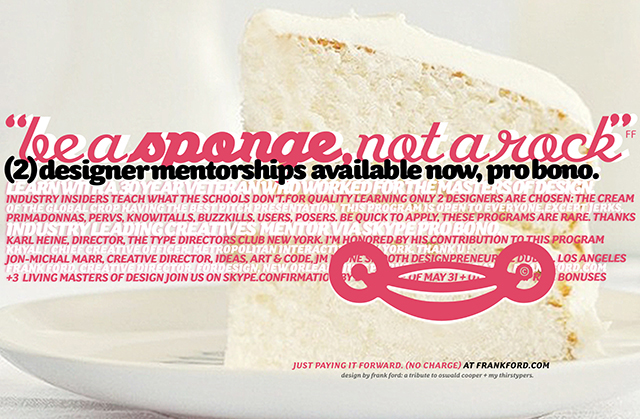
™<teachable moment> let me find a way to wrap this portion of the story. give it your best "you shouldn't take it so hard" solo record by keith richards.get the project done, move on, keep learning. i've been around this block10 times — you cannot experience this level of joy at a corporations art dept., nor from now magazine or bookflavor of the month by expert–x. my advice? go explore whats next, who's next. a perfect fit is out there for you. but only you can find them. safe to say the safe 9 to 5 won't provide the "satisfaction" we desingers crave. but are you willing to work all day monday through all night wednesday when your boss catches you a big fish? a fish of say mick jagger proportion? (no. mick will not be asking you to come hangout with him on the conrer of the west 8th street and the 6th avenues) for how long will you be willing to sacrifice your personal life? are you planning on marrying your career? welp, know the + and the – before taking that plunge. i married my career thirty years ago, and we've been together ever since. heh. i think it's time we started seeing other people though. "be a sponge not a rock" your first semester is now complete :- ™teachable moment(s) next up: rick's 10 commandments of love.
next project: more with the masters: history doom
album cover design for vh1 + mick jagger / i created while at titanium with the legendary de witt. master mentor (2) michael jager / jdk founder: jagerdesignproject.com + solidarityofunbridlelabour.com (images link) next ≥ master mentor 2 michael jager: solidarity of unbridled labour—top 10 design studios in the usa my definition of "rockstar" a universal force, a star–powered (not of the glam variety) with inspired power that follows you + you follow it. not doing so, you lose your mojo, your swagger, your lust. and there's no love without lust. which is why i often require a muse. i have no problem calling the folks on this page or myself a rockstar.they are also my muse. michaell jager? he's my muse–ician mentor of vision—my god can this guy MAKE and uncover things most would overlook. i've learned from michael through osmosis how to deliver the good(s).
the story of 3 cities + 4 rockstars continues... was it all from me?
it wouldn't be my first unidentified extrasensory experience. was it manifested via rick? mick? michael? myself? did they unknowingly assist, inspire and prepare me for this? i thought so. i've got their ghosts man! they inspired this album cover and so many others. oh the glamour you say? not.hard work and late night dedication? yep. all of my mentors instilled in me the danger of idol worship and how style–lies! a smalll part of what makes these guys great, why do they endure? they know the art of art deirection, they find your strengths and they play them up. all the while building your confidence, they are boss/mentor all at once. more importantly, they create and radiate positive vibes. have you noticed your best work happens when you feel good? (more later) but remember, confidence is a HUGE part of this game folks.you either believe in self–manifestation and have faith or you don't. i will go just a bit more on that...
lessons learned from my supervisor + mentor michael jager
michael jager has a hand in a lot of my work.resisting his style was not easy. learning from him IS. a brilliant guy devoid of pretense, he was there, many years albeit ghostly. heck, he still inspires me.one lesson learned in his studio remains a memorable right turn on my path.on a blistery cold june day, yes. june. it was effing snowing! there at jdk in burlington he defended my use of my favorite 2 letter word i had placed on his client brochure. everyone else thought my headline was lame. too lazy. too eay. too this / too that.my cranbrook compadres were consequently bitch–slapped by michael at my desk. omg, i cannot express those 5 minutes adequatley. he stepped up and toweled me off on another occasion that same summer. i was being teased that i had a bizarre use of color. i admit that. but michael said boldy in front of everyone "you guys, you dont see it. frank's use of color has a european sensibility, and it's obvious to me he knows his art history. bingo. he nailed that one too. ever since then i used the headline "go" every chance i could get away with it.and have not changed my strange color theory.and here again i attempt it for vh1. more + karma unknowingly arrives after the creative brief. mick had titled his work "go" also, insisting vh1 use it. i already had! my career is packed with much nuttier. stay tuned. point being — things like michael jager did? they stick. they transform your development and they prove you dont have to be a salesperson to be the cream of the crop director in the usa. but you do have to provide a supporting rationale for your work.take note from rick + from michael and after a lifetime, myself.
*that* is how you art direct–it's not a title, it's your duty! learn your staff's buttons + press them. gently. thoughtfully. get out of their way, teach them to see, and show them how they get in their own way! be the impetus. yeah! i have spoken.but isn't it nutz the detail you remember when you respect another artist and their work! its not silly, this path can be full of magic, serendipity andextreme love and lust and wonder. i will never drill it in enoughyou choose your destiny, you decide who you work with. based on your criteria. do not ever appear needy or hungry to anyone in this biz. and youre better off as starbucks best barista for a year than you be acquiring uninown damges of a job that does not fit you or your soul. hey! weve got to protect that creative spirit. screw around and let that heart, that spi
™class project / i'm not here to force your hand. i'm merely a guidepost. my job is to force you into realworld exercises like our next one: your assignment: write a graphic novel or letter, or whatever / to your 50–year old self. tell the old you what you wanted in your life! tell that older version of you exactly the path you chose, why and explain what you accomplished, and anything you think you may have missed out on. i want to see you attack this project in huge detail. (hint: a big sketchbook creatively crammed, illustrated would be great) because this is a no-rules design and writing project serving as chapter 1 of your career survival manual. this project will inform our next class, next class, next next next until you're ready for survival in the digital jungle. we will grab any fears by the horns. and tackle it now.™another morale? be patient, absorb. your day will come. just dont force it.the droolworthy designer job, it can have a way of finding you when your're ready. especially in the cloud of social media. (more later)
™<teachable moment> it's only rock and roll. don't beat yourself up! you'll kill it next time up for bat. i've learned more from michael than even he knows,but it takes time to deploy. first of all—you need clients who will allow you to bust out! btw: he designed one of the top 10 brochures in the history of design named "living brand" recieving it was a true gift. the gift of a realworld education. a co-worker stole it from my office. yeah it was that good.he continues to contribute in a big way. watch him beat the drum of solidarity.i'm going to paste a recent email from jaeger here. even us older dudes need a pep–talk now and then. jaeger does it without even trying.how? again, with the use of thoughtful language.remeber—we are communication professionals, that's what's on sale here! so let's get the basics done right.here's an excerpt—he edited my subject line to read "design lifevolution (like myself and rick—always making word plays) his timing was cosmic.the people on this page, the good we can bring?—good as gold. sometimes our goods are gold too :-) i was feeling shattered from working without much sleep or much reward when—a huge influence on my career as an artist, david bowie had died early morning of january 11. that week everything in my world was on a system of a down. bowie's passing was a pretty big deal for me and my friends. but there's always light in those dark doorways. it was so HUMAN hearing from my awesome colleagues that day. linda, cary, and michael—
below is the email paste:
Frank, welcome to the new now! wonderful to see your voice and thank you for your shared sentiments and heart felt insights on true creative hero David. Your thoughts we’re pure of heart, respectful of his art and his decades of resonating positive and relentless impact on the world, its ideas and ideals. I too felt the respect and loss to the core. I too was the kid who lovingly painted lightening bolts across my jean jacket to wave the Bowie flag others feared so. Frank—it’s great to know you are still creating, inspiring and making a positive presence felt in the world.And thank you for your kind note and thoughts on our time explored in the creative cloud of JDK design.
Be well, be inspired. Create fearlessly! Time is waiting in the wings!
Michael Jager “Nothing is a mistake. There’s no win and no fail. There’s only make”
™<teachable moment> years later and the guy can still inspire me like no one else with his smart choice of words. remember that! words are poiwerful things. and we are in the word business. up until about 2005 i insisted on printed portfolios, digital or print work regardless. i'm glad yet irritated to say that the portfolio samples related to the story above are my "most never returned" from reviews, tryouts and interviews. ain't that some shit? sorry frank we can't hire you but we have no problem in stealing your work! literally, physically, obviously, missing from my book on pick-up day.stolen by some of the biggest names in new tork city, san fran, chicago and boston. i won't name the names that would shock you.—so glad we could be of assistance in creating your fame + list of awards. N E X T > when you are the sponge, not the rock? (and there's some big boulders in this industry!)
the smallest of things will spur you on. when you're head is clear and your heart open simple things like a word from a friend can really snowball into a mountain of positive energy. that's a key ingfredient to my secret sauce—positive energy. it's required to deliver your best creative.i've seen it in myself and in my colleagues so many times. you think i'm zen? i have colleagues that dosome really out-there stuff for positive energy flow. it's required for your foundational development too.your first job should be with a creative director who shares this philosophy of positivity and making mistakes, most of the really good ones do. avoid negative energy at all costs.it will burn you out faster than anything else. naysayers or deadwood directors will program your entire circuitry incorrectly.which forces the question...what will you bring to your next cd? plus, those cds of negativity? odds are they're burning out A N D they're a effing buzzkill. who wants to be around that shit all day. we'll converse on this topic via skype.i know i treat you guys as though you are my children. haven't had any complaints yet so thank you. to close this thought—why would you want to work for some d*ck anyway? because they're this years model in all the right magazines? Pffft...i should expel you now but i'll let you learn that one the hard way. see the entry "starDumb" in your workbooks.
master mentor (3) dann de witt / the name de witt is a perfect fit, every minute was an education in rarified, esoteric branding and advertising. like me, he doesn't do self promotions, so you may not have heard of him either. you think he cares? pfffft...dann is all about the new new way to *think* about the new new thing. ya know it would take pages and pages for me to recant the lessons learned from this, this, un-categorizeable mmm...genius¿ there. i said it. i never call anyone that but i've been on journeys, some ADventures with this guy that are worthy of a novel. i made a big career sized mistake on this one, but i had to.(more later)
![]()
next workshop > the 10 design commandments.
![]()
![]()
![]()
mon© furniture / colors to finalize / deep asian metallics with spot varnish is my plan
like the red and purple above. whew. if you only knew how long i've been wanting to work on a modern furniture account! modern furniture / japanese influence with france as the target. hired to create the name, logo, tagline, business cards and a mailer. this shoots me right in the sweetspot. a typical FF branding project. i shouldn't even be showing(off) before © process. looks and feels like them, their products, their philosophy.the french should love it."mon" translated from french means mine. spelled backwords it means name. i love that to death! sounds like a photo–op using refelection may be on the shot list. mais oui trébienbien et bonchance a moi.™<teachable moment> considerations for global client work for instance: use of the color red symbolizes something entirely different in morocco than it does in france.good benefits about being raised in casablanca? you grow up speaking french. and with new orleans as a french city i'm well versed in the language. those 2 things have helped me win several international clients. clients know that i'm sensitive to cultural relevance. what i design in america i would not do in paris or casablanca or milan.
i still make custom corporate and identity fonts. some of them are here, some are at my LI online portfolio. technoiire is my most popular typeface (in terms of sales and influence). a big family of 7 styles. 2 of the styles were in wide use in television, film and graphic design. technoire is deemed by typographical gearheads as the most influential font of the1990's (topping 4 emigre fonts) a career–thrilla! pricing? dirt cheap. all fonts are free to students and faculty. also free if used on a high exposure project with credits. email me, we'll work it out."loving the alien" is a free downloadable sample of myfavorite dingbats / spot illustrations (drawn when the song by the same name was released) custom type available for clients. deposit or retainer required. contact: ideas@frankford.com
only available here: technoire™ | ghetto prince™ | stroke | zydeco | paradise | loving the alien < free sample
![]() more links out to other portfolios
more links out to other portfolios
frank ford / the american african yep. ain't that some chit! :-)
that's me saddled with my first girlfriend ever. fatima is her name. pure as the driven snow. when i would give her an american penny she would drop to her knees in tears.1 penny. imagine that if you will. that was also the daily salary of her mother our housekeeper and nanny. you can imagine when i gave her a dollar bill. queen for a month she'd be:-) every time i think of fatima an old U2 song enters my head—"she is a refugee, and someday, one day, she's gonna live in america." thank god i'm living here. after a retro slideshow my friends really get why i've always believed U2's "refugee" is one of the top10 best rock songs ever recorded. and my manhattan friends they have a new appreciation for their pristine city and laidback lifestyle:-) true. fyi: $40.00 supplies one moroccan with clean water for life. yes, life. +for every $40 you give to this charity? i will give you 1 free hour of creative services. saving a life: that's warm and fuzzy, but having *your* life saved is a beautiful miraculous experience.
![]() more samples / next image simultaious miracles gifted by rv while in genoa italy
more samples / next image simultaious miracles gifted by rv while in genoa italy
![]()
pure fun, fresh work this winter / painting the road in a new way / an unpublished set of photography that looks like paintings raw, sized and cropped only. couldn't sharpen if i wanted to bc they're so delicate. the high–res looks like paintings but they are photographs.the panels line up like the golden gate bridge to babylon. some are beautiful mistakes that look like actual oilo paint. inspired by my mentor robert rauschenburg—a great artist, teacher and humanitarian. i think of him often. believe it or not? bob was a perfectionist (worse than me) which is saying a lot. you'd never know by seeing his finished work, but yes a major stickler for details.image below: my paintbrush: 1 of 5 large panels reading left to right. painting a suspension bridge on my snow covered street this winter in south la. maybe global warming is true. it has never snowed here before so i seized this day. reversing and forwarding at 45 degree angles. stopping to take a shot and repeating the entire day.

![]()
<teachable moment> my mentor bob rauschenberg
priv%te / unpublished set of beautiful photographs (if i do sayso myself)
i was honored by the robert rauschenberg foundation in a private ceremony. / the ultimate career high. b e y o n d words. the ultimate modern artist. a great teacher, so truly compassionate and giving to art students, there will never be another bob in the entire history of art.
a man who defined paying it forward. even after his death in 08. everyone brags on their latest this or upcoming that: thats not my idea of success. real success? is when THE RIGHT PEOPLE FIND YOU: it's called being discovered on merit.the happiest days of my life are when i sit in bob's chair–it's a reject from one his final works of art. all because of one teeny-tiny flaw in the patina. he made me feel at ease about being such a perfectionist. believe it or not folks? raushchenberg was an extreme perfectionist, putting me to shame, and that's saying something.seems i can only think clearly near large bodies of water these days. i think of him often. i feel his ghost when i come here seeking inspiration, or to regroup from a crappy life experience, or just to chill. i feel the dude's soul, it's weird our connection, i won't go into it. the definition of innovator, the king of paying it forward: a TRUE louisiana boy. he loved helping students. many of us wouldn't have the courage to even applyfor a bfa were it not for this awesome human being. so blessed by the robert rauschenberg foundation
bob raushchenberg is the reason i became an artist.it makes my other awards seem trivial. it makes thirty years of commercial art ugh nevamind. i am eternally grateful to pam at the foundation. the greatest gift i have ever recieved. if you ever read this? i'm working on a gift for you but it's taking for ever. rarely will you see me boast about accomplishments it creeps me out. and i'll never reveal the wonderful set of photographs. the feeling is undescribeable. the rareity of it. having something only available to a dozen people on planet earth. i'm such a proud–poppa on this one. it makes my other awards feel insignificant. they just can't touch this. the pride of such rareity—it keeps me going. it gives me reason to believe the next thirty years will be even better
©frankford 2017 / wrongful or illegal use will likely result in swift action from a powerful foundation.